
I'm available for new opportunities and projects
Notable Case Studies


Daily Design Feed
Mon 26 Jan 2026
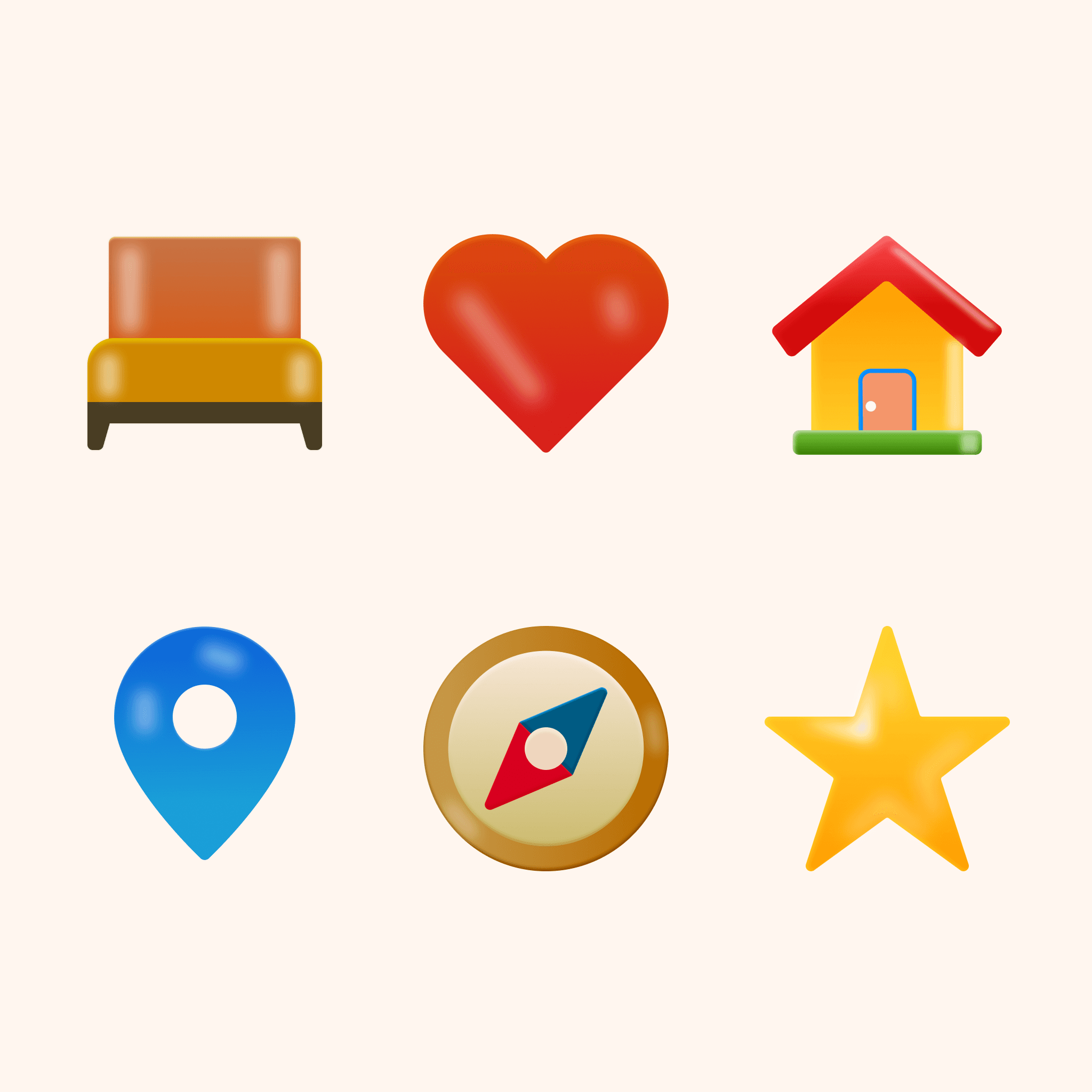
3D Icons
Icons, Product Design, Web Design, Web Site, #Zahravisuals
Fri 23 Jan 2026
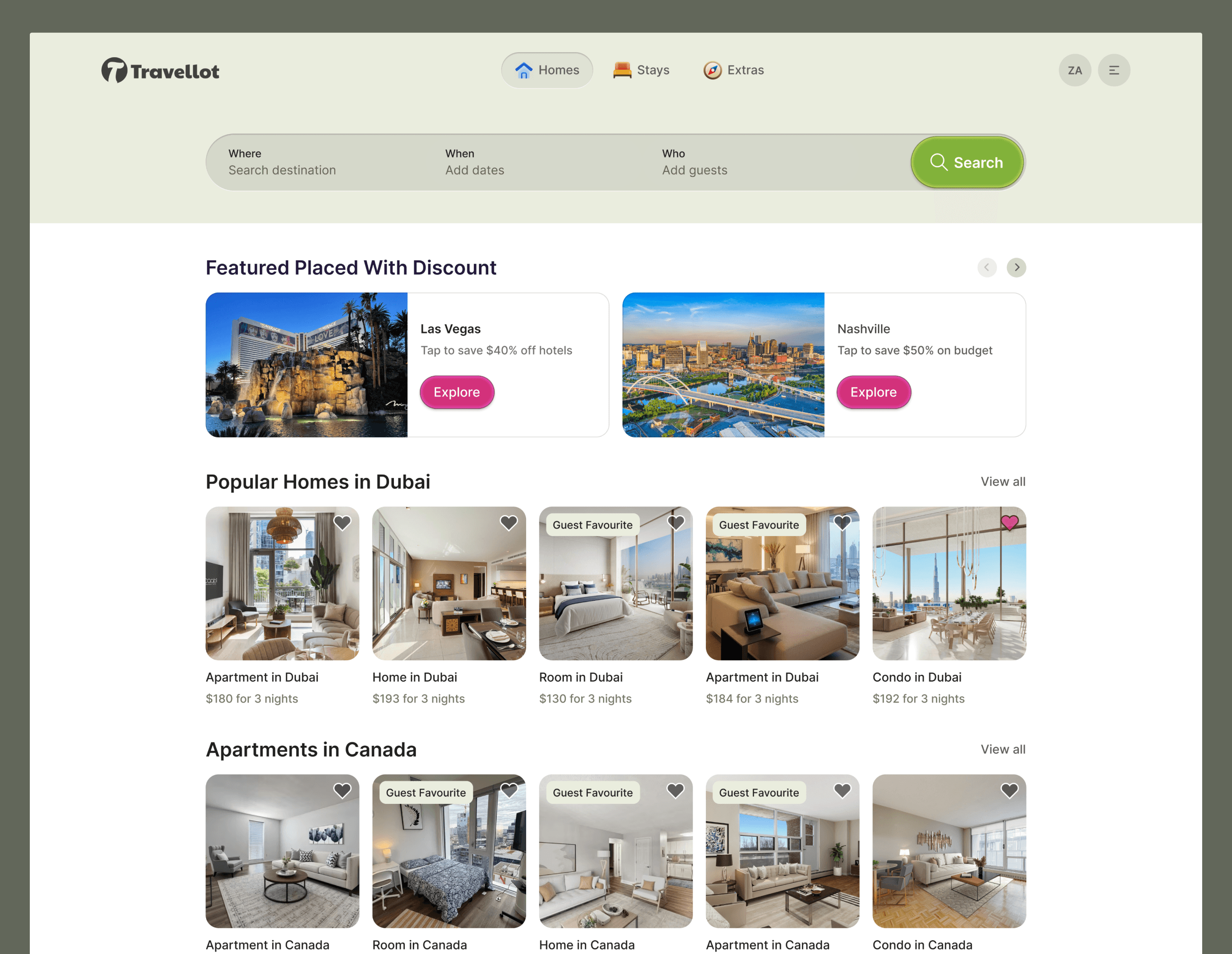
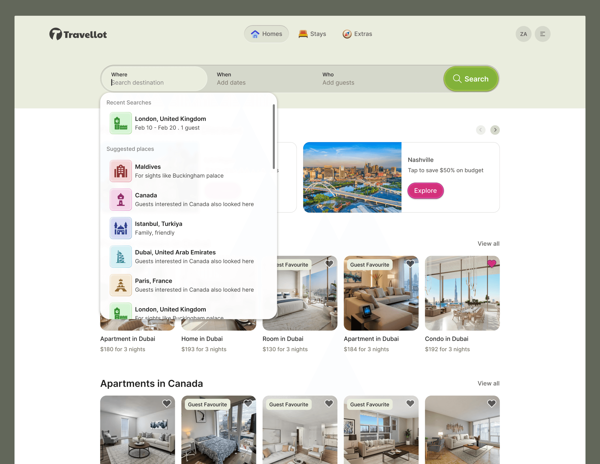
Travellot
Full Webapp, Travellot, Product Design, Web Design, Web Site, #Zahravisuals
Fri 9 Jan 2026
TaskFlow AI
Full Landin Page, TaskFlow AI, Product Design, Web Design, Web Site, #Zahravisuals

Mon 5 Jan 2026
Pricing Card
Hero Section, Product Design, Web Design, Web Site, #Zahravisuals

Wed 17 Dec 2025
Pricing Card
Pricing Plan, Product Design, Web Design, Web Site, #Zahravisuals

Mon 15 Dec 2025
Floria Logo
Logo, Product Design, Web Design, Web Site, Floria #Zahravisuals

Wed 10 Dec 2025
GreenLeaf Plants Hero-section
Every detail and spacing was carefully considered.
Hero Section, Product Design, Web Design, Web Site, Team Section, GreenLeaf#Zahravisuals

Thu 4 Dec 2025
Zaro Jewellery
Zaro Jewellery landing page where I explored a retro color palette to create a warm, classic look.
Every detail and spacing was carefully considered. I truly enjoyed designing this project.
Full Design, Landing Page, Product Design, Web Design, Web Site, Team Section, Zaro#Zahravisuals

Wed 3 Dec 2025
Zaro Hero Section
Excited to share the hero section from a new project.
This project encouraged me to explore retro color palettes that are different from my usual style, and I really enjoyed working with them.
Here is the final hero section design.
Hero Section, Product Design, Web Design, Web Site, Team Section, Zaro#Zahravisuals

Fri 8 Nov 2025
Skillea Team Section Design
Trying something non-conventional for this team section. Really enjoying experimenting with the lines and shadows.
Product Design, Web Design, Team Section, Skillea#Zahravisuals

Sat 1 Nov 2025
Skillea Hero Section Design
I'm super excited to share my new hero section for Skillea with soft gradients and a fresh, modern dashboard.
Product Design, Web Design, Hero Section, Skillea ,Zahravisuals

Mon 13 Oct 2025
Storea Feature Cards
I’ve been working on improving storea section, focusing on smooth interactions and a better shopping experience.
E-commerce, Cards,Product design, Website, Widgets design, UI/UX ,Zahravisuals

Fri 3 Oct, 2025
Notes Design Building Blocks
I’ve covered all the building blocks for my web app, Noteza.
Cards, Todo app, Product design,Note-taking, Webapp, Widgets design, UI/UX ,Zahravisuals

Sat 27 Sep, 2025
Noteza Event Card Detail
I'm currently refining the Noteza app by simplifying the structure and user flows, and adding more visual weight. Here's the improved event card and its detail modal
Cards, Todo app, Note-taking, UI/UX ,Zahravisuals

Mon 22 Sep, 2025
Noteza Cards
I have created to-do cards that I’m currently working on. The newly launched Apple glass effect in both dark and light modes.
Dark & Light Modes, Cards, Todo app, Note-taking, UI/UX ,Zahravisuals

Wed 17 Sep, 2025
Noteza Calendar
Designed a calendar view for Noteza, making it easier to connect notes with dates, plan ahead, stay organized, and even change the date of any note.
Calendar, Todo app, Note-taking, UI/UX ,Zahravisuals

Thu 11 Sep, 2025
Skillea Iteration
Currently working on a landing page for an educational platform—just finalized this iteration! My focus is on keeping the design modern and glossy, while highlighting the value proposition to help the platform sell better.
Hero Section, Educational app, Business Partners, UI/UX ,Zahravisuals

Wed 2 Sep, 2025
Foodpanda City Thumbnails Redesign
The existing city thumbnails on Foodpanda felt too static and lacked context. They only displayed the city name without showcasing what makes each city unique in terms of food culture.
I’ve created two versions
Which one do you think works best 👉 FP 01 or FP 02?
foodpanda, Website Redesign, Business Partners, UI/UX ,Zahravisuals

Mon 1 Sep, 2025
An e-commerce store explored in two styles
Straight – minimal and timeless
Glass – modern and futuristic
Both designed to make shopping simple, engaging, and user-friendly.
Mobile Website, E-Commerce, UI/UX ,Zahravisuals

Tue 26 Aug, 2025
foodpanda Pre-Login Redesign – Partners Section
I redesigned the Partners Section to make it more informative and actionable. The current design feels empty with just text and a generic CTA.
My Improvements:
• Showcased trending restaurants with order stats
Added testimonials from restaurant owners
Outlined clear onboarding steps & benefits
Used a Call-to-Value instead of a simple CTA
Alongside UX changes, I also explored a modern, glossy Apple Fluid Glass-inspired style for a fresh yet functional look.
foodpanda, Website Redesign, Business Partners, UI/UX ,Zahravisuals


Tue 12 Aug, 2025
Wireframe to Final Hero section
A platform that empowers students to explore and take courses.
This design exercise was an opportunity to push beyond flat visuals and explore richer UI styling.
I experimented with gloss, light, and gradients to create more visual weight and depth, while maintaining a user-friendly, intuitive experience.
To-do, Productivity, Learning, Web App, Hero sections, Wireframe ,Zahravisuals


Thursday 22 May, 2025
Hero Section Design for Noteza
While working on Noteza, I designed two different hero sections to explore the best first impression for the app.
I’ve been working on Noteza and recently I have designed two hero sections for it.
Blue one is Cool tones for clarity and calm
Pink one Warm tones for creativity and friendliness
This exploration helped me define the direction of the overall site.
I’m still deciding which one captures the user’s attention better but both reflect the app’s core goal: helping users master their day, one note at a time.
To-do, Productivity, Note taking, Web App, Hero sections ,Zahravisuals


Friday 16 May, 2025
faysalbank Mobile App Light & Dark
Dashboard, Faysal Bank, Mobile App, Dark Mode, Light Mode ,Zahravisuals


Wednesday 30 April, 2025
Noteza Mobile App
To-do, Productivity, Mobile App, Dark Mode, Light Mode. ,Zahravisuals


Monday 28 April, 2025
Gmail Redesign
I use Gmail daily and I really like it, but I wanted to add more personality, contrast, and visual appeal.
The new layout features a clearer hierarchy, better spacing, and improved visual weight, making it easier to spot important actions and information. Beyond colors, I also carefully reworked the email list, icons, and overall structure.
To-do, Productivity, Web App, Redesign, Gmail ,Zahravisuals


Friday 25 April, 2025
Noteza To-do App
I know there are already plenty of to-do apps available in the market.
But I wanted to design a To-Do / Notes app that feels intuitive, clean, and personally meaningful something I’d genuinely use in my daily life.
Noteza is a smart to-do and note-taking app that’s not just functional, but also aesthetically pleasing.
It comes with dark and light modes, smart categorization, and multiple note types (like journals, checklists, and agendas), allowing every user to customize it according to their unique workflow.
This isn’t just a design project it’s a creative solution to a real need in my everyday life.
To-do, Productivity, Web App, Dark Mode, Light Mode ,Zahravisuals

